smpl
figma design
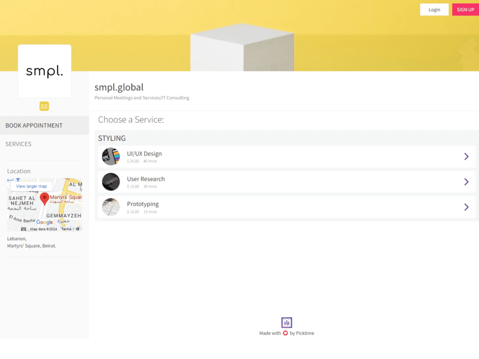
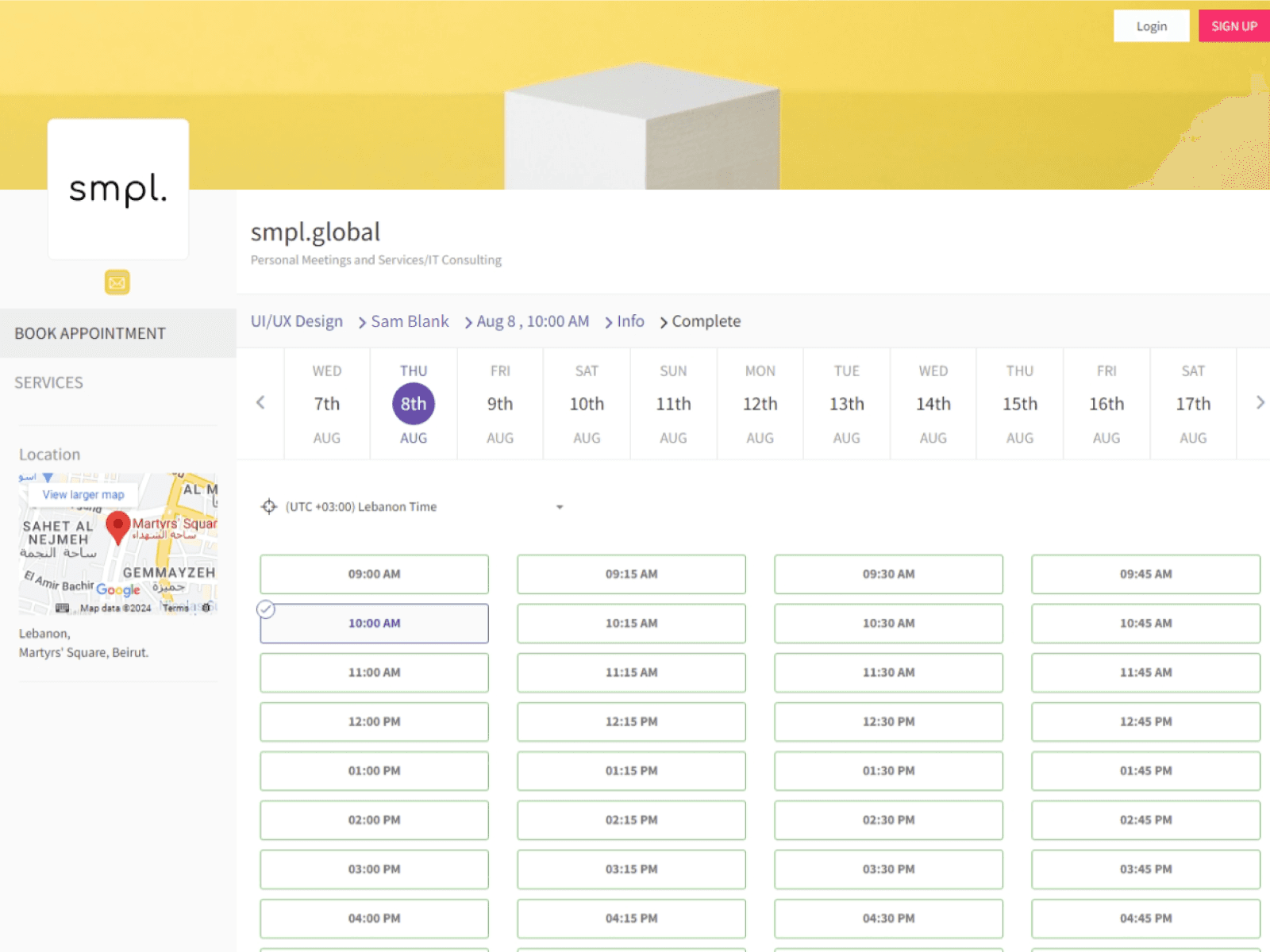
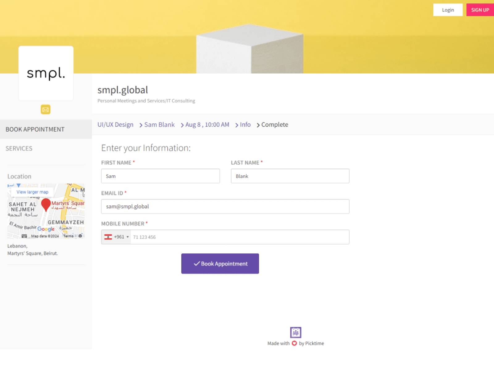
information overload
tight spacing
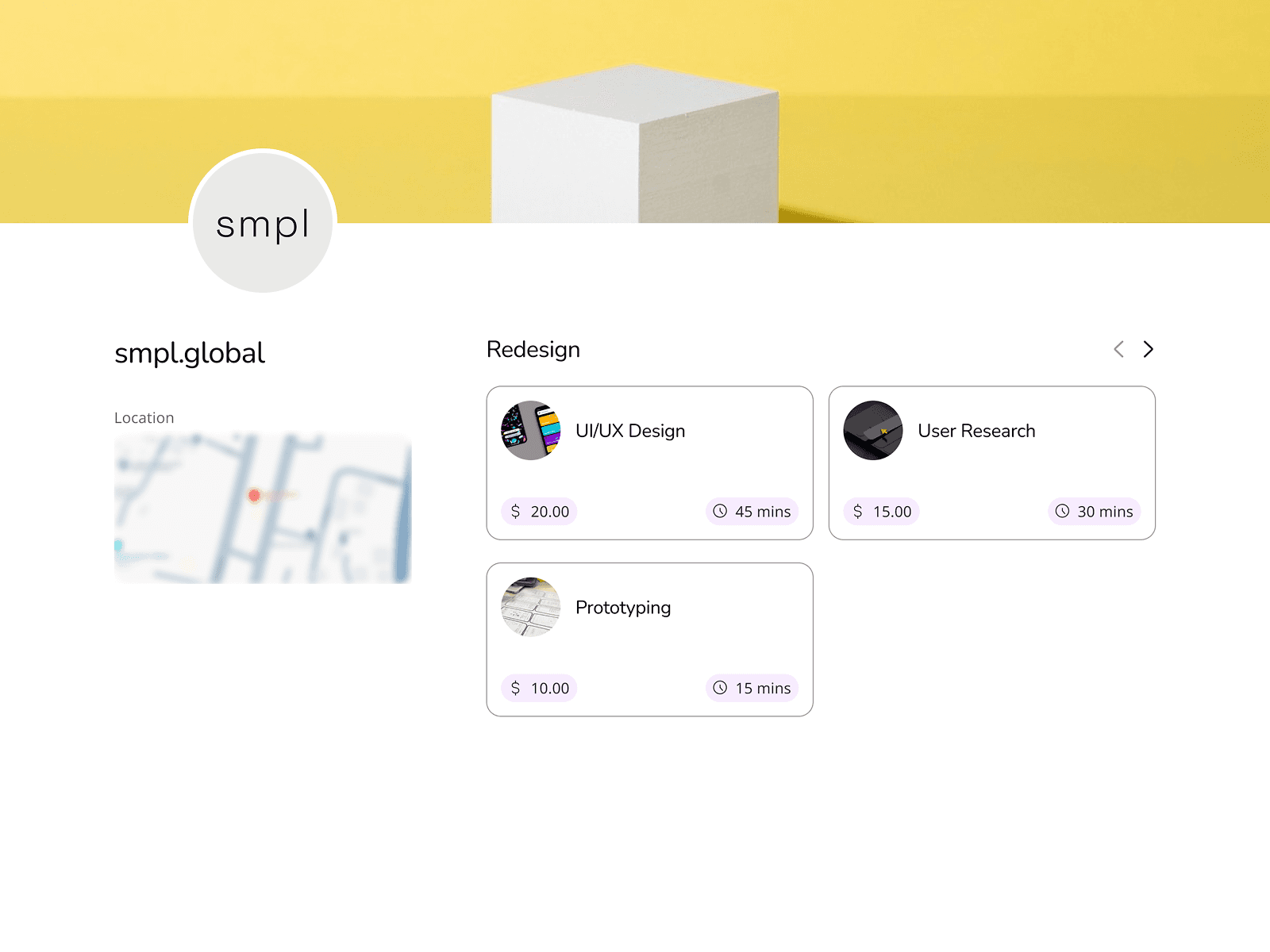
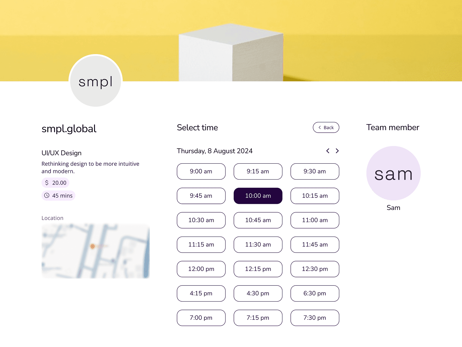
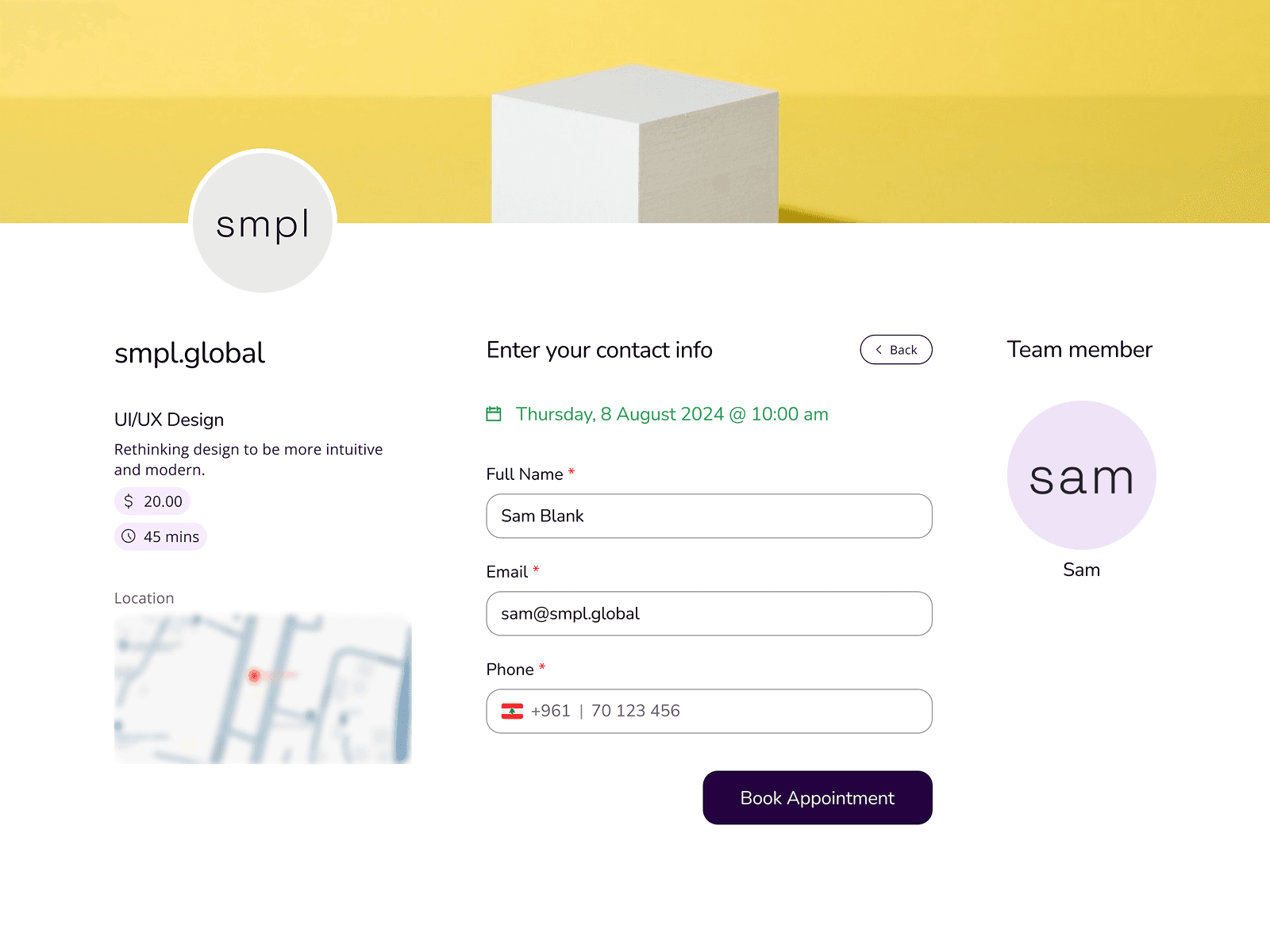
removed unnecessary details
more breathable elements
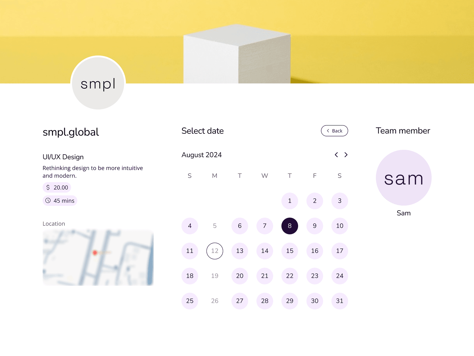
clickable "unavailable dates"
too much scrolling
clear date availability
all in one screen
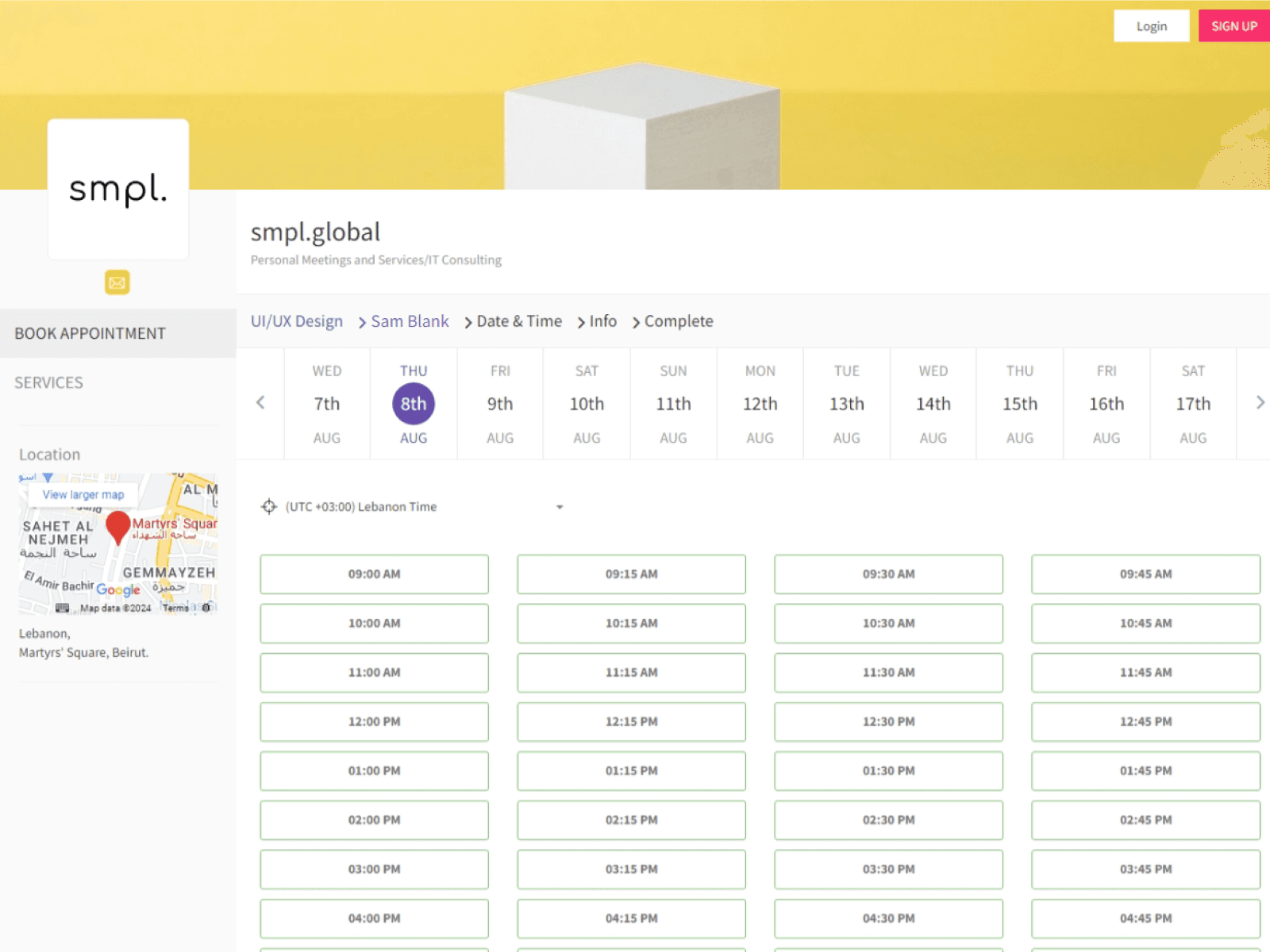
hidden "time availability"
manual checking required
only available times displayed
less clutter
hard-to-find date/time selection
too generic
highlighted date/time selection
feels lively
great products fail if can't be used
schedule a call